Show off your best pearltrees with redesigned embed!
New York Street Photography, par johnperivolaris
The new design leaves almost all the space for your pearls, we have refined and streamlined the design of the embed to best present your pearls to your readers.
In addition, the overview of the pearltree as well as the arrows and zoom slider will appear, allowing your readers to better explore your pearltree while zooming in and out to better see your pearls.
Lastly, your readers can now discover the pages you’ve pearled by opening them in a new tab with a single click, making it possible for them to choose precisely what they want to read.
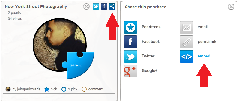
Tip: all you have to do to embed a pearltree on your blog is to click on the sharing button in the detail window (only from your computer), and then click on “embed” to copy the code and paste it in your CMS.


Incredable pearl, love it 🙂
Great redesign. Can’t wait for the Android app. Then it’s off to embedding on my site and doing business!
Thanks !